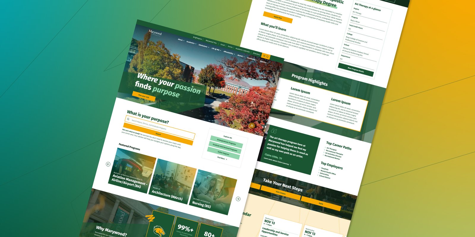
Challenges
- One website serving four very different audiences: prospective students, current students, parents, and faculty
- 24,000+ indexed pages and 100,000+ sessions a month, from core program pages to one-off landing pages, all needing to feel like one site
- Stakeholders with competing goals: in-house developers, executive leadership, and departmental leads
Goals
- Make Marywood’s site somewhere people can actually find things
- Give the brand a look that works everywhere the university shows up
The Audit
The Campaign
The Fix
The System
Nobody could find anything
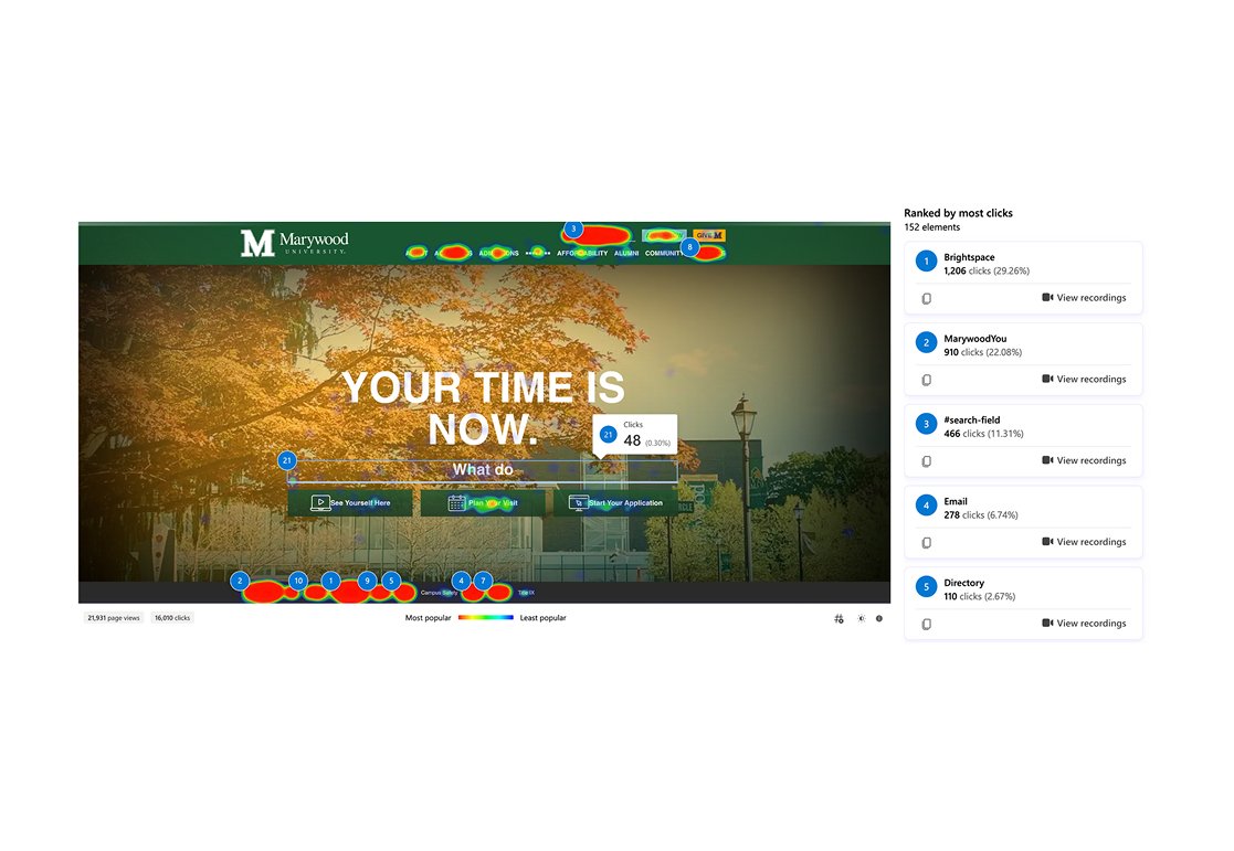
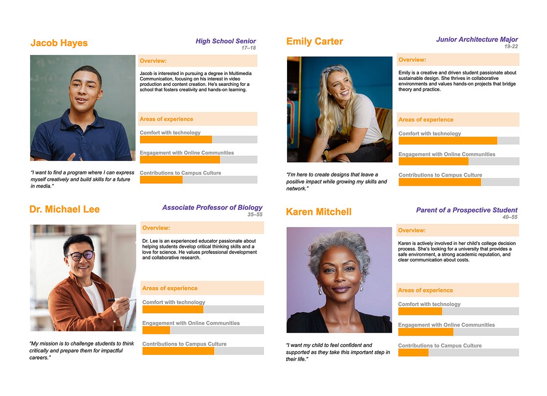
Rather than relying on our best guesses as professionals, we let research set the direction. I audited the site through a user survey, heuristic evaluation, and months of Clarity and Analytics data, then built personas from what we found.
The findings were blunt. Over half of survey respondents said the search bar was how they usually found anything, but analytics showed fewer than 2% of all visitors ever touched it. Our survey skewed toward faculty, staff, and current students, people on the site every day, and even they had given up on the menus. Visitors who didn’t know that trick were on their own. That included prospective students: the site actually had a dedicated program search, but almost nobody reached it, because the homepage pointed everyone at the generic search instead. Hard to apply to a program you can’t find.
“I’m sure it’s there, it just is buried somewhere.”
A staff respondent from the user survey
The First Campaign
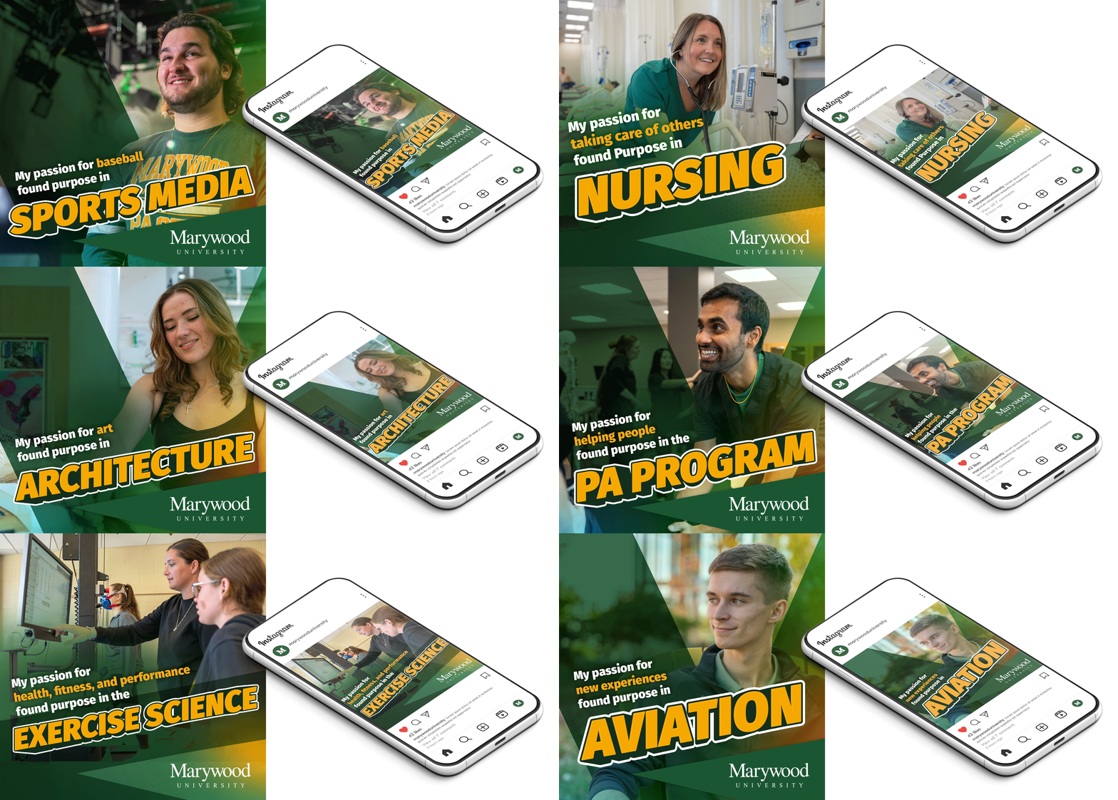
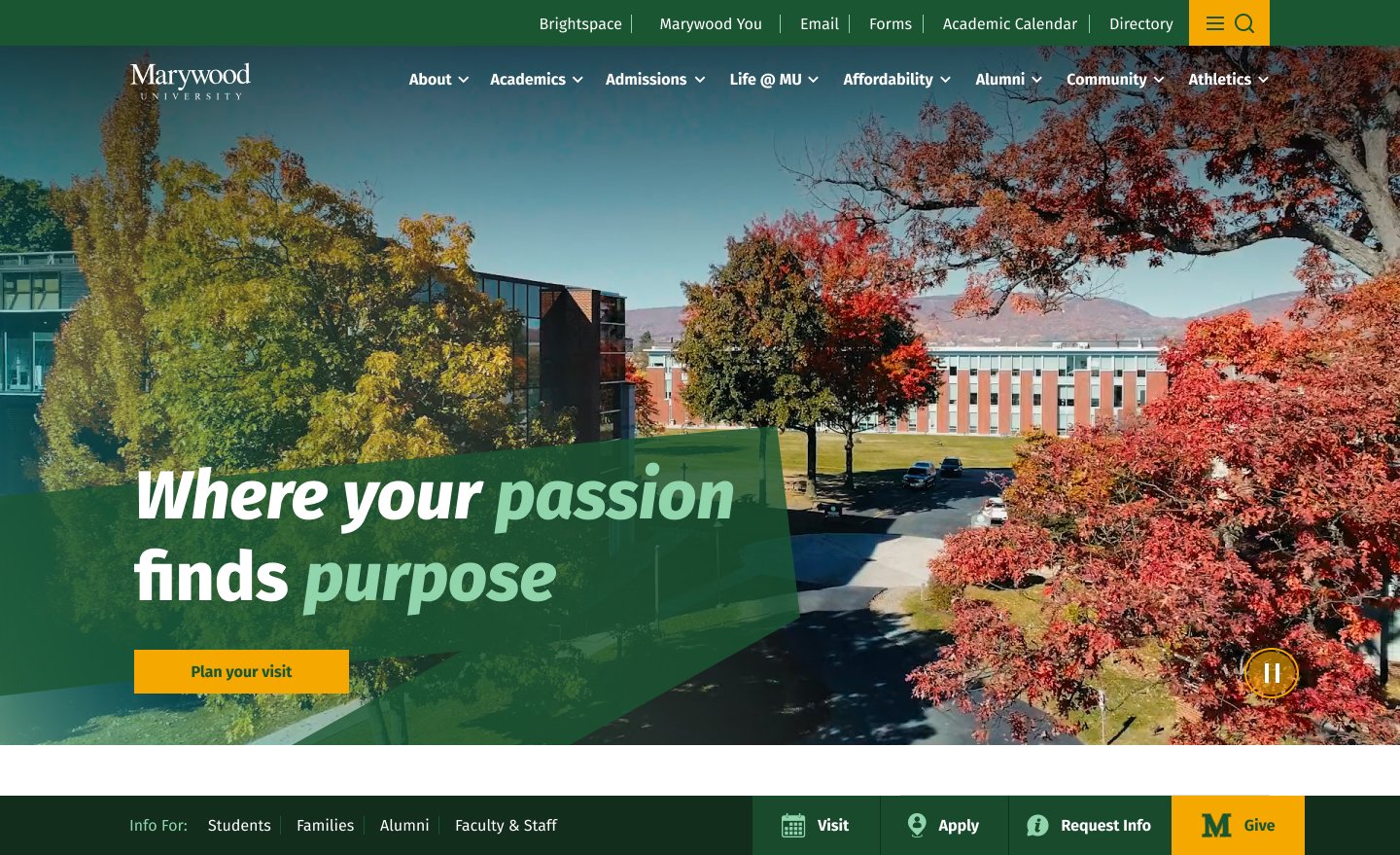
“Passion, Purpose” started as one of a few directions for the first campaign Marywood ran with Posture, and became the concept that helped shape what Marywood’s visual direction looks like today. Students were interviewed around campus about what they’re passionate about and how that passion found its purpose at Marywood. I developed the visual concept: each student centered against real career scenery, spotlit by the M from the Marywood logo. Those elements carried straight into the website.

Making things findable
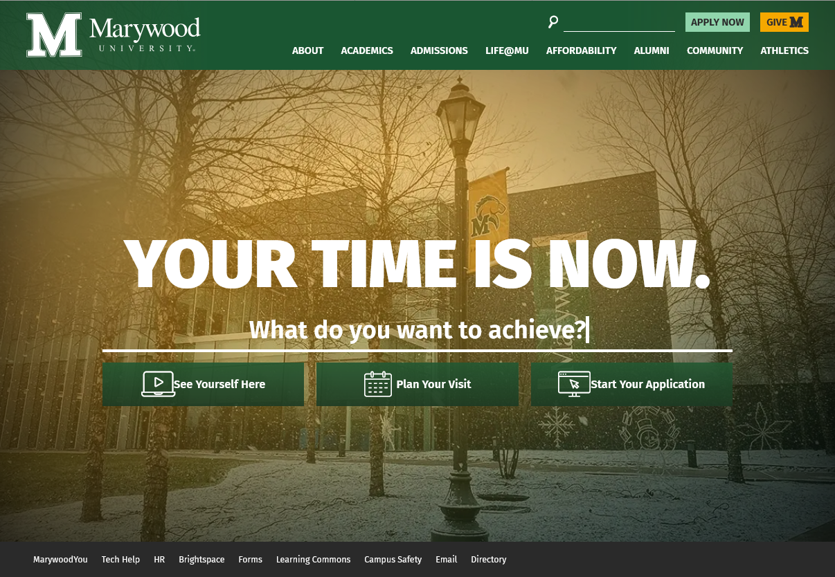
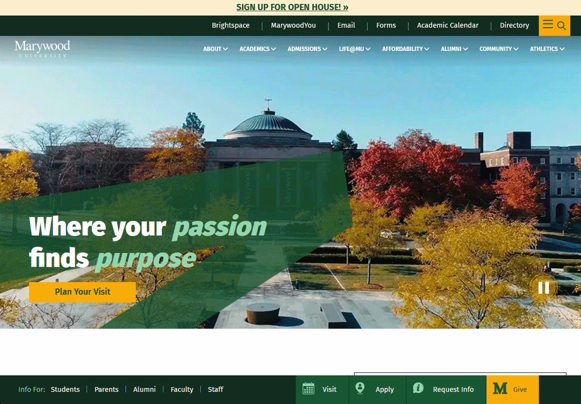
The redesign started where the data pointed. The old homepage asked “Your Time Is Now. What do you want to achieve?” a vague question with an even vaguer site search bar as the first CTA. A dedicated program search already existed one level down on the programs page; the homepage just took the gamble that what the user was looking for was somewhere on the website. So we rewired the front door. The homepage now asks ‘What is your passion?’ with the program search right under it. Still a vague question, but grounded by everything around it and tied to the Passion, Purpose message. The generic search stayed at the top of the page where users expect it, now with quick links to the most popular searches to help users navigate to where they are looking faster.
The site’s second audience
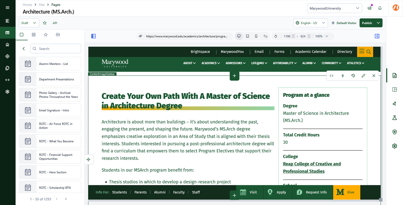
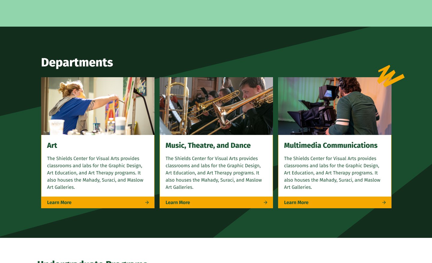
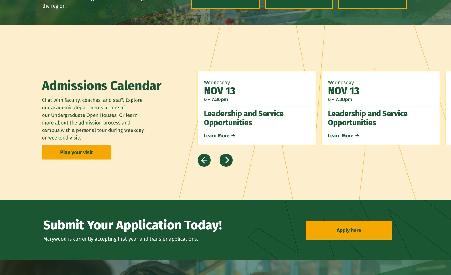
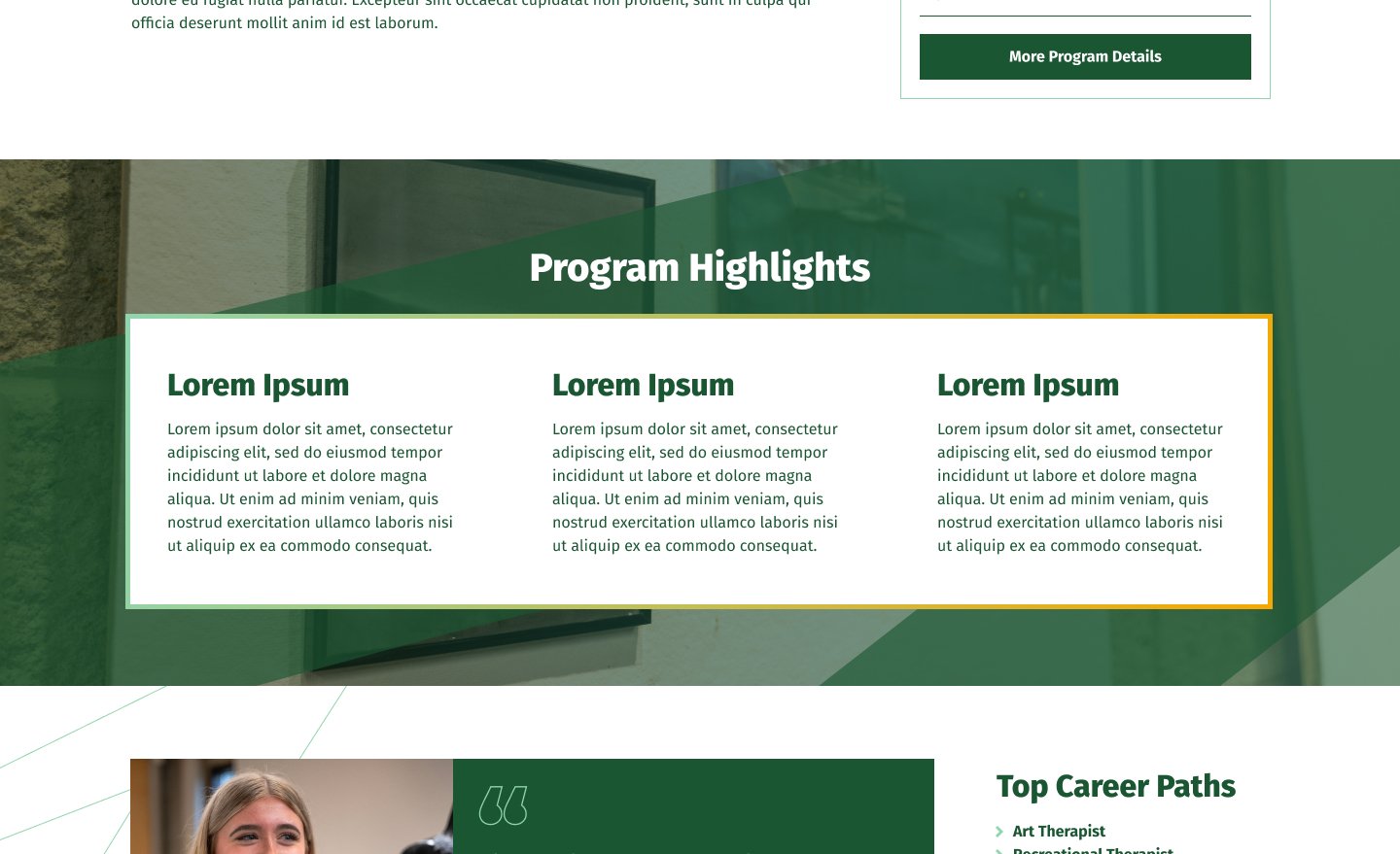
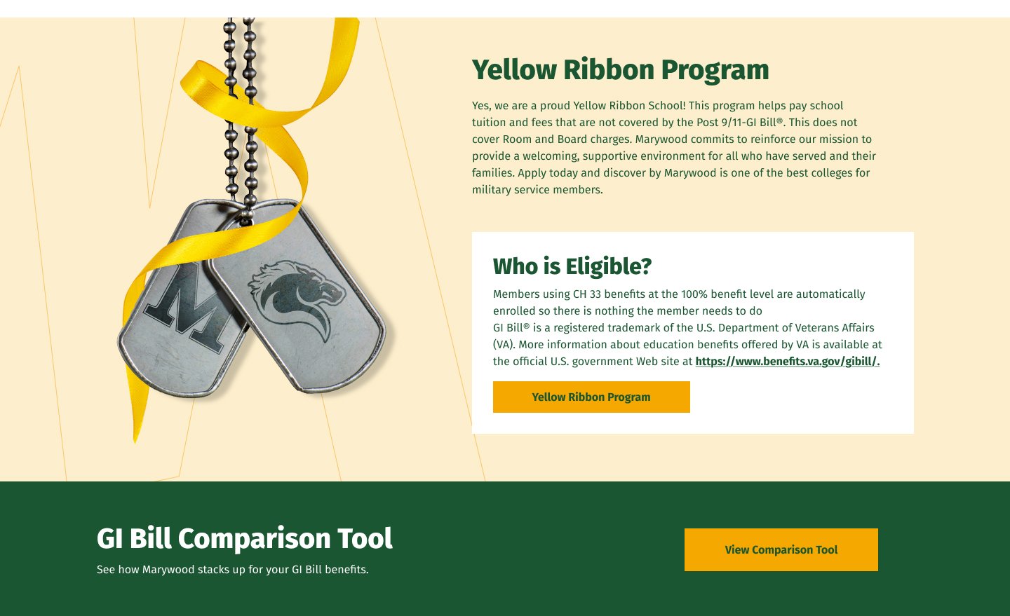
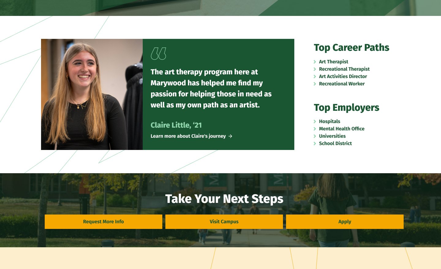
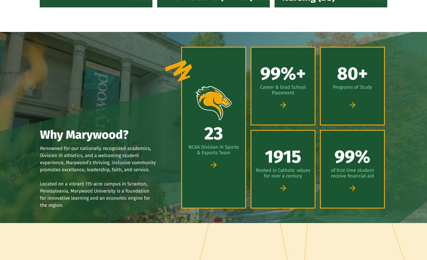
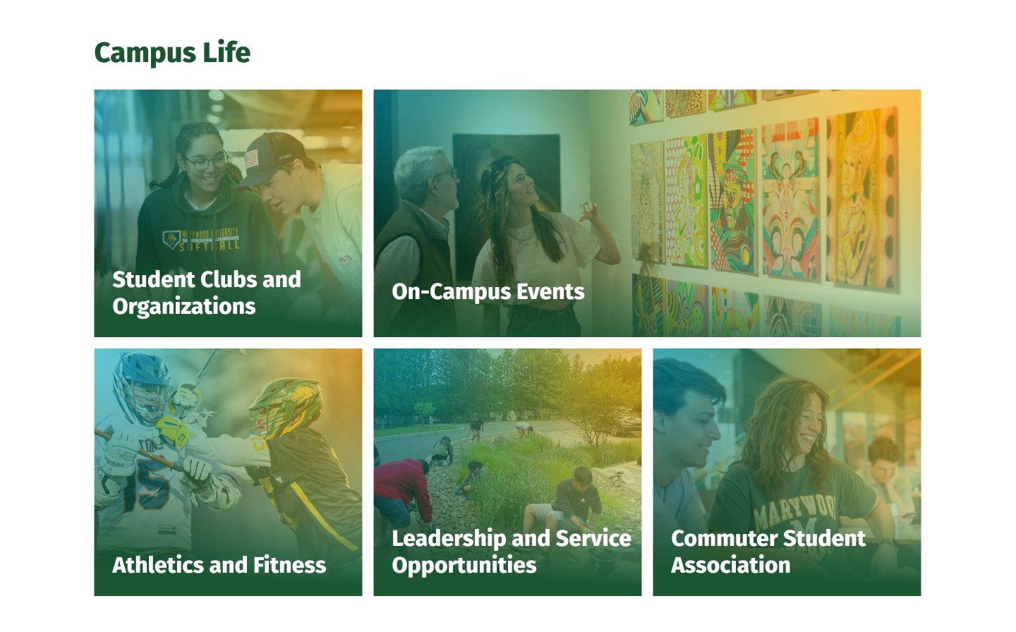
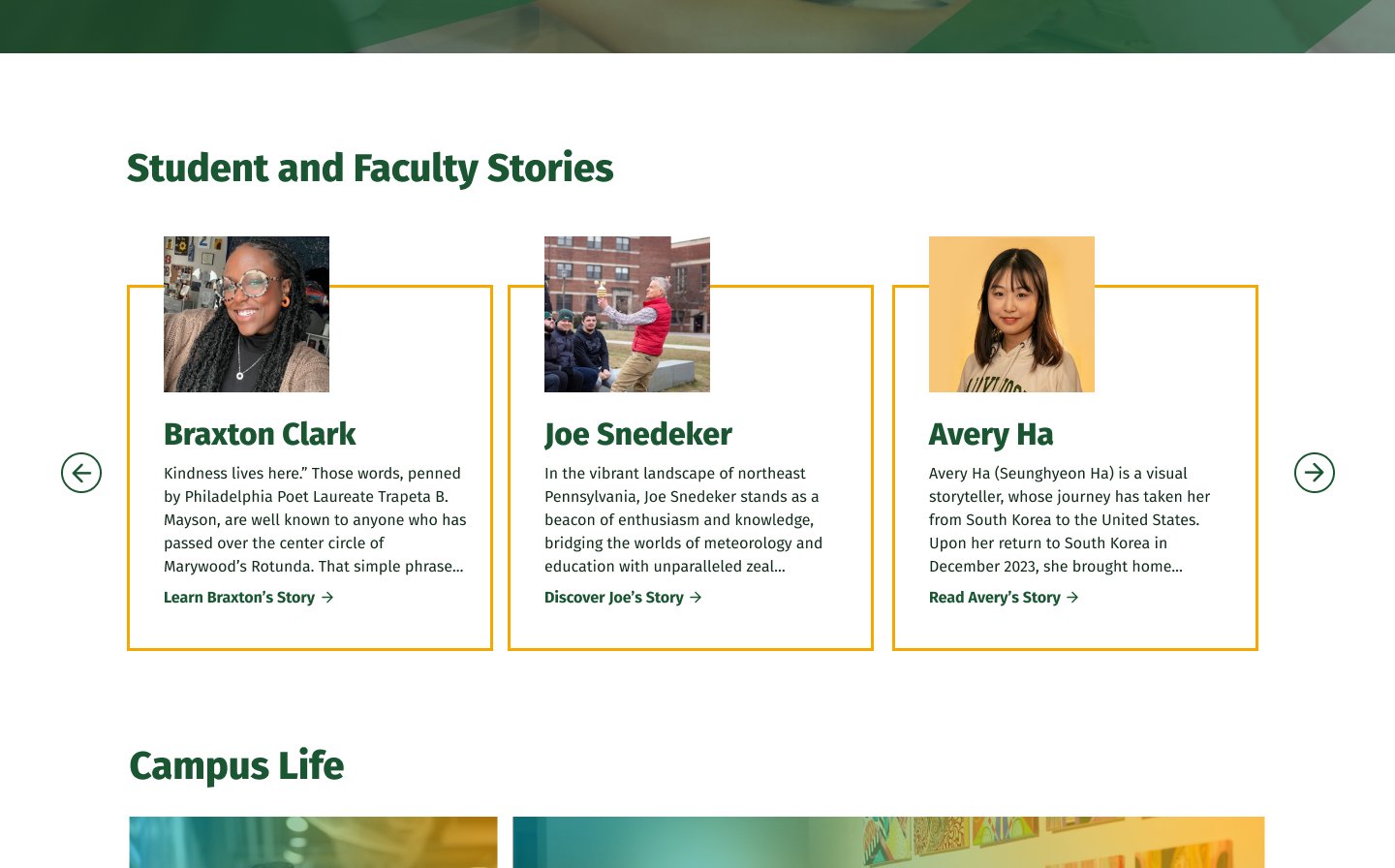
Visitors weren’t the only ones struggling. Every new page needed a developer and nearly a full day of build time, and the requests kept coming. So as Posture’s dev team took on more of a leading role for the site, I designed a component library and many of the pages assembled from it. Page production dropped from a full day to as short as an hour, and building a page no longer required a developer at all, opening the site up to more hands to help.
Still building
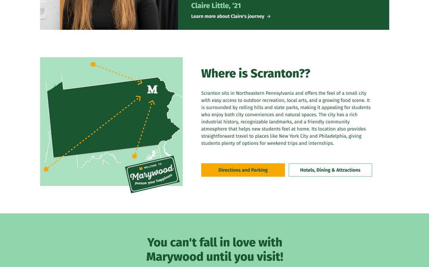
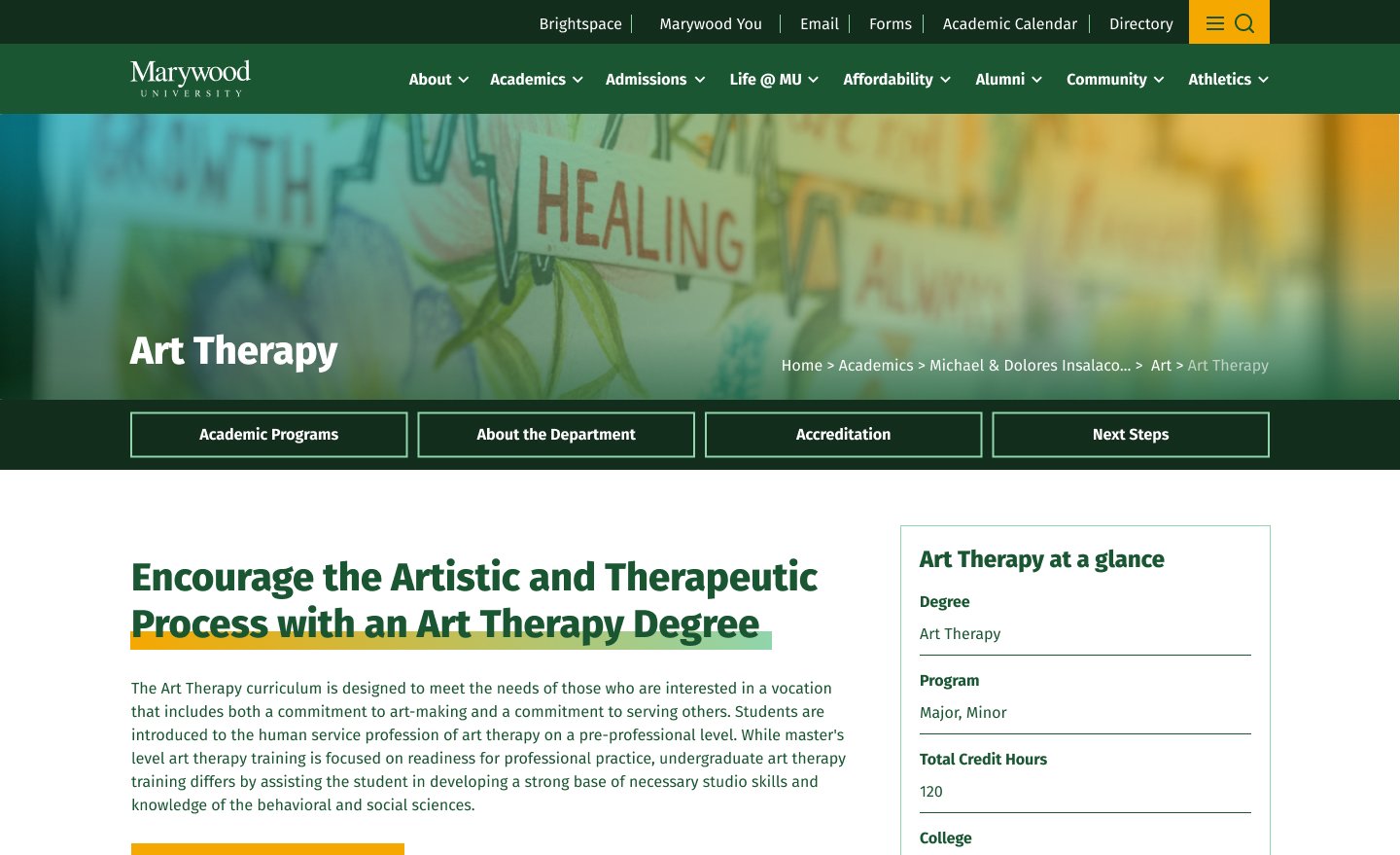
The system’s real test is time, and it continues to improve as new needs come along. Posture continues to design new pages and improve old ones expanding the library today, for a site doing over 100,000 sessions a month. A year after launch, program page views were up 30% even as overall traffic dipped, and the program section had grown from around 120 pages to over 400, built on the system. Program pages were our main focus when the system started, and that growth was only possible by opening up page-building to the people who know the programs best: the program leads themselves.
Reflection
I expected Marywood to be a classic full redesign. The scale made that impossible: 24,000+ pages and stakeholders from in-house developers to executive leadership. But the bigger lesson was about who a website is for. We went in designing for four audiences: prospective students, current students, parents, and faculty. The work revealed a fifth: the people who build the site. Designing for them is why Marywood could improve piece by piece instead of all at once, and why it keeps getting better today.