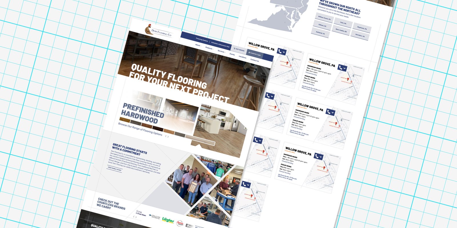
Challenges
- Nearly every primary action linked out to manufacturer sites with no path back
- Manufacturer info was inconsistent: some brands got a pop-up, others nothing but a logo and an outbound link
- NXP, the online ordering portal, was only mentioned after login
- Giving every manufacturer a real page meant creating content for 50+ of them by launch
Goals
- Give contractors a reason to buy through Derr before they leave
- Better explain what NXP ordering is and make it more relevant to users
- Give every manufacturer a real page with real context
- Support repeat buyers, Derr’s core business
The Problem
The Wrong Instinct
The 50-Page Bill
The Payoff
The site was sending everyone away
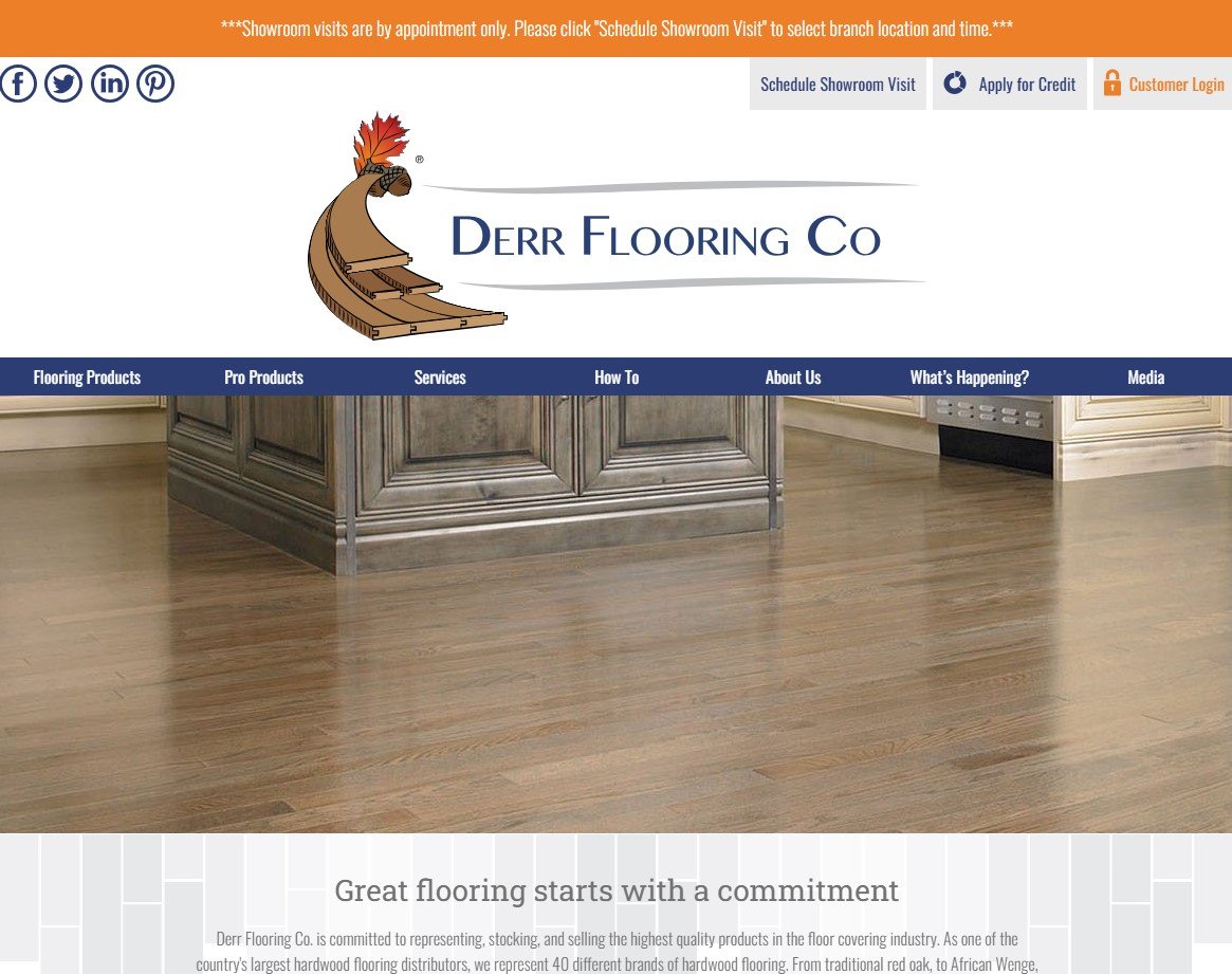
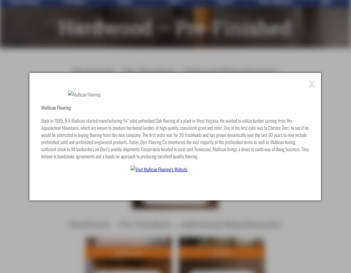
Derr’s old site was built to inform, not to sell. Its most prominent actions were scheduling a showroom visit and applying for credit, while actual ordering sat behind two logins: the site’s, then the NXP portal’s. Nothing on the page explained what “NXP” meant, so even a logged-in user could miss that they could order directly. Running a heuristic evaluation, I kept hitting the same confusion: some manufacturer cards opened a pop-up, others sent me straight off site, and the pop-up’s only action was to leave too. Every road led away from Derr.
My first instinct was wrong
My first instinct was to kill the outbound links and show products directly on Derr’s site. Competitor research proved me wrong: across the industry, distributors link out, and for reasons that held up. Product catalogs live in third-party systems with their own logins, and a distributor listing specific products can read as a limit when the truth is the opposite: Derr can order anything its manufacturers make.
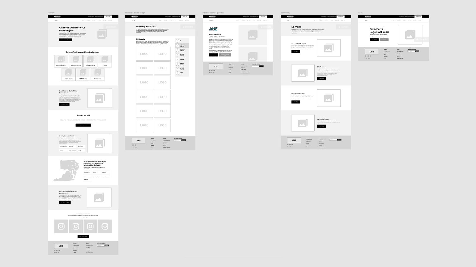
So the fix inverted. Instead of stopping users from leaving, give them context and a purchase path first. I restructured the architecture to surface NXP ordering everywhere, explain on the homepage what it actually is, and give every manufacturer a real page on Derr’s site before sending users out to the wilds of the internet.

My own call handed me a 50-page bill
I knew what the directory would cost the moment I put it in the sitemap: 50+ pages each needing a logo, a description, and product photos, and content fill was already my job. What I didn’t predict was how stretched I’d be when the bill came due, or that I’d need support to hit launch. So I built a process the two of us could run in parallel: an AI writing pipeline grounded in a short excerpt from each manufacturer’s own site so nothing was invented, paired with real product photos, every page tightly reviewed before publish. A teammate joined me on this challenge, and together we brought the directory to 50+ pages by launch; it has since grown to 65.
What the pages do now
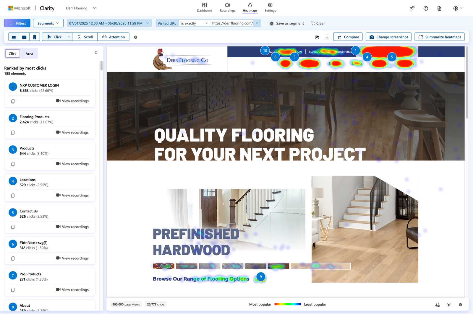
On today’s homepage, the most clicked element is NXP Customer Login, drawing 43% of all clicks, roughly four times its nearest rival. The purchase path that used to hide behind a login is now the first thing users reach for.
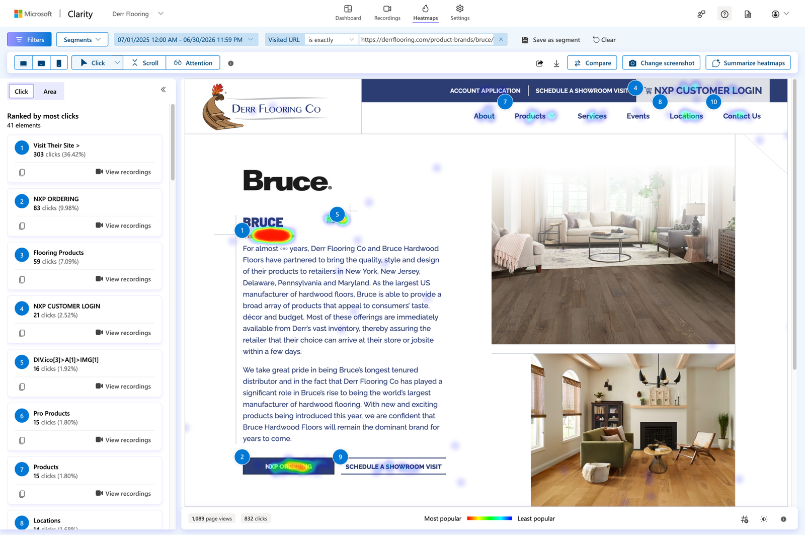
The manufacturer pages hold their end too. Visitors who reach one view 2.79 of them on average and spend 34 seconds engaged per page: contractors comparing brands, the exact behavior the old site couldn’t support. And on those pages the outbound link still gets the most clicks, by design. The difference is what sits next to it: across the full directory, ordering is now the third most-clicked element on manufacturer pages, drawing 8% of all clicks, a click that structurally couldn’t happen before, because the button didn’t exist there.
The pages also opened a door I didn’t design for. Over the past year they earned 745 clicks and 90,400 impressions from Google Search, led not by household names but by niche brands where Derr’s page can actually rank. The directory built for on-site context doubles as an acquisition channel for the long-tail brands.
Reflection
Derr was the first site I carried from UX research through QA, and the decision I’m proudest of is the one that cost me the most. The manufacturer directory was the right call for users, and I made it knowing the content work would land on my own plate. I’d make it again. Owning a decision through every phase it touches, including the expensive ones, taught me more about weighing UX choices than any framework has.